Pick a sidebar and you're betting users want AI beside them all day. Pick a spotlight and you're betting they want their viewport back between queries. The real AI UI pattern tradeoffs aren't about aesthetics. A persistent panel compresses every tool you're working in by roughly 20%. An overlay that vanishes after each use stays invisible until someone teaches your users the keyboard shortcut. The tension between sidebar vs spotlight AI UX determines whether you're solving for conversation depth or spatial layout. And knowing when sidebar beats spotlight means admitting most teams guess instead of testing what their users actually do after they get an answer.
TLDR:
- Sidebars claim 20% of your screen (300-400 pixels) but win for multi-turn workflows where context matters.
- Spotlights work best for single-query tasks in data-dense tools like CRMs and dashboards.
- 90% of users don't know basic keyboard shortcuts exist, so discoverability beats elegance.
- Composite uses a spotlight overlay to preserve full-width views in tools like Salesforce and Jira.
Understanding Sidebars and Spotlight Interfaces in AI Design
Two UI patterns dominate how AI shows up inside your browser, and they reflect opposite bets about attention.
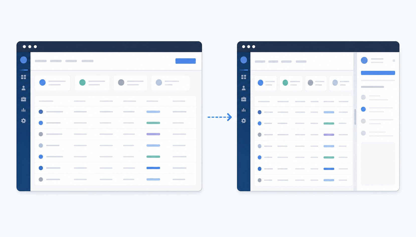
A sidebar is a persistent vertical panel pinned to one edge of the screen. It stays visible while you work, always ready, always watching. Think of the chat panes bolted onto tools like Claude in Chrome or Gemini. The AI is a constant neighbor, whether you need it or not.
A spotlight interface works differently. It's an overlay you summon with a keyboard shortcut, use for a specific task, and dismiss. Nothing lingers. The screen returns to exactly what it looked like before.
The split between these two patterns isn't cosmetic. It reflects a deeper question about where AI should live relative to your actual work: beside it, or behind it until called.
Interface | Pattern Type | Screen Space Used | Best For |
|---|---|---|---|
Composite | Spotlight overlay summoned with keyboard shortcut | Zero persistent space; borrows full screen momentarily then disappears | Single-query tasks in data-dense tools like CRMs and dashboards where viewport compression hurts usability |
Windows 11 Copilot | Sidebar docked on left or right edge | Permanent 300 to 400 pixels, roughly 20% of a 1920x1080 display | Multi-turn conversations where persistent AI presence outweighs screen real estate cost |
Claude in Chrome | Sidebar chat pane bolted to browser edge | Permanent vertical panel that compresses your working viewport by approximately 20% | Iterative workflows like debugging code where scrollable conversation history acts as working memory |
Gemini | Sidebar interface integrated into browser | Fixed panel that claims several hundred pixels of horizontal space continuously | Tasks within Google Workspace where the ecosystem integration warrants the viewport trade-off |
The Screen Real Estate Equation
On a standard 1920x1080 display, a docked sidebar typically claims 300 to 400 pixels of horizontal space. That leaves fewer than 1,600 pixels for your actual work. Percentage-wise, you're handing over roughly 20% of your viewport to a panel you may only glance at a few times per hour.
For someone writing a document or reading email, that compression is tolerable. But if you spend your day inside a CRM dashboard, a multi-column spreadsheet, or an analytics tool, those missing pixels force horizontal scrolling or collapsed columns. The data gets harder to read precisely when you need it most.
Windows 11's Copilot sidebar shows the tension well. Microsoft recently added the option to dock it on either edge, but the fundamental cost stays the same: persistent AI presence trades screen real estate for proximity. A spotlight overlay, by contrast, borrows the full screen for a moment and then gives it all back.
When Persistent Visibility Beats On-Demand Access
Sidebars earn their keep when the conversation with AI spans more than one exchange. A developer debugging a function, for instance, might paste an error, get a suggestion, try it, then paste the new output. Hiding the AI between each step would mean re-summoning it four or five times in two minutes. The panel's persistence removes that friction entirely.
Multi-turn workflows like these share a common trait: the AI's previous response is still useful context for the next question. Long data analysis sessions work similarly. You ask for a summary, then a breakdown by region, then a chart recommendation. Each prompt builds on the last, and scrolling back through that thread while your spreadsheet stays open beside it is genuinely faster than starting fresh each time.
If your work involves iterative back-and-forth with an AI over minutes, not seconds, a visible conversation history is working memory, not wasted space.
The cost is real, but the payoff scales with conversation depth.
When Minimal Disruption Beats Constant Presence
Not every AI interaction is a conversation. Sometimes you need a single answer, a quick rewrite, or a formula suggestion, and then you're done. In those moments, a persistent panel sitting beside your work is overhead you never asked for.
This is especially true inside tools where spatial layout carries meaning: a Figma canvas, a Salesforce pipeline view, a multi-tab analytics dashboard. Compressing any of these by 20% to accommodate a chat pane distorts the very thing you're trying to work on. A spotlight overlay sidesteps the problem entirely. You invoke it, get what you need, and your viewport snaps back untouched.
The pattern suits workflows built around short, self-contained queries instead of iterative threads. One prompt in, one result out, gone.
The Discoverability Problem Both Patterns Share
Neither pattern works if people don't know it's there. The visibility gap shows up differently for each, but the root cause is the same: users can't adopt what they haven't found.
Sidebars seem to have the advantage here because they're always on screen. Yet "visible" and "noticed" aren't synonyms. A panel that sits in the periphery long enough becomes wallpaper. Users minimize it, ignore it, or forget what it can do beyond the first thing they tried.
Spotlight interfaces face the opposite version of this problem. They're invisible by design, summoned only through a keyboard shortcut. That's elegant once you know it exists, but most users don't internalize keyboard shortcuts. If someone hasn't made Cmd+F a reflex, expecting them to remember a three-key combo for an AI overlay is optimistic.
So sidebars risk being tuned out, and spotlights risk never being found in the first place. Onboarding and contextual nudges matter more than the pattern itself.
Context Awareness: How UI Placement Shapes AI Behavior
Where AI lives in the interface shapes what users expect it to do. A sidebar, sitting alongside your work for the duration of a session, reads as a collaborator that accumulates context over time. You treat it like a colleague looking over your shoulder, someone you can turn to mid-thought.
A spotlight overlay sends a different signal. Because you summon it, use it, and dismiss it, the interaction feels transactional. The AI becomes a utility, not a companion. That framing changes how people prompt it: shorter queries, more specific asks, less expectation of continuity.
Neither framing is inherently better. But the mismatch between placement and intended behavior is where frustration creeps in.
Mobile and Responsive Considerations
Sidebars and spotlights behave differently once the viewport shrinks below tablet breakpoints. A sidebar that works well on a 1440px monitor can consume the entire screen on a phone, collapsing any sense of persistent, side-by-side context. At that point it functions more like a modal overlay than a true sidebar, and the UX advantage disappears.
Spotlights, by contrast, already assume a single focal point, so they tend to degrade more gracefully on small screens. The tradeoff is that any multi-step workflow requiring frequent switching between the AI panel and the underlying page becomes tedious on mobile regardless of pattern.
When choosing between sidebar and spotlight patterns for responsive contexts, consider these factors:
- Touch targets need to be large enough for finger interaction, which limits how much sidebar content you can display without scrolling
- A collapsible drawer pattern can preserve the sidebar's persistent feel while reclaiming screen real estate when the user needs it
- Progressive disclosure matters more on mobile, so spotlights that surface one action at a time often feel less overwhelming than a dense sidebar panel
Most teams we've talked to treat mobile as a spotlight-first environment and reserve sidebar layouts for screens above 768px, adjusting AI UI pattern tradeoffs based on the device context their users actually work in.
Hybrid Approaches and Middle Ground Solutions
Some teams have stopped treating this as a binary choice. A few hybrid patterns have gained traction, each trying to split the difference between persistent presence and on-demand minimalism.
Collapsible sidebars that shrink to an icon rail give users a visual anchor without the 300-pixel tax. One click expands the full panel; another collapses it. The AI stays findable without permanently compressing your workspace.
Peek modes take a lighter approach: the panel slides out on hover or a brief keystroke and retracts automatically when the cursor moves away. You get sidebar-like continuity for a few seconds, then your viewport returns intact.
The most ambitious variant is context-aware switching, where the interface reads what you're doing and adapts accordingly. Writing a long document? The AI stays docked. Reviewing a dense dashboard? It retreats to a spotlight overlay. The logic sounds appealing, but getting the heuristics right is hard. An interface that guesses wrong about when to appear feels more disruptive than either pure pattern would on its own.
How Composite Uses the Spotlight Pattern for Professional Workflows
We built Composite around the spotlight pattern for exactly the reasons this article has been working through. When you invoke Composite with Cmd/Ctrl + Shift + Space, a lightweight overlay appears over your current tab. Use it, and it vanishes. Your Salesforce pipeline, your Jira board, your multi-column analytics view stays at full width the entire time.
That matters because our target users are individual contributors who live inside data-dense tools all day. A recruiter cross-referencing candidates across LinkedIn and an ATS, or a PM triaging bugs across Jira and Confluence, can't afford to lose a fifth of their screen to a chat pane they check intermittently.
For longer-running tasks, Composite's notification system delivers updates asynchronously, so there's no need for a persistent panel just to watch progress. And because actions run locally in your existing browser with up to five concurrent threads, the work happens in the background while your viewport stays yours.
Final Thoughts on When Sidebar Beats Spotlight and Vice Versa
You don't need to pick one pattern forever. Some workflows need visible conversation history and benefit from a docked panel; others need clean viewports and work better with an overlay you summon and dismiss. The mistake is choosing based on what feels modern instead of what your actual tasks require. If you spend your day in multi-column dashboards and want to see how a spotlight pattern handles that without compressing your workspace, get in touch and we'll walk through it.
FAQ
Sidebar vs spotlight AI UX: which UI pattern uses less screen space?
Spotlight interfaces use zero persistent screen space: they appear as an overlay when summoned, then disappear completely. Sidebars typically consume 300 to 400 pixels (roughly 20% of a standard 1920x1080 display) permanently, which compresses data-dense tools like CRMs and dashboards.
What's the best UI pattern for multi-turn AI conversations?
Sidebars work better for multi-turn workflows where each prompt builds on the last, like debugging code or iterative data analysis. The persistent conversation history acts as working memory, removing the friction of re-summoning the interface four or five times in two minutes.
Can I use a spotlight interface on mobile devices?
Yes, and spotlight patterns often degrade more gracefully than sidebars on small screens. Sidebars that work well on desktop can consume the entire viewport on mobile, collapsing any sense of side-by-side context, while spotlights already assume a single focal point.
When sidebar beats spotlight for your workflow?
A sidebar beats a spotlight when your work involves iterative back-and-forth with AI over minutes instead of seconds, and you need scrollable conversation history visible alongside your main task. Single-query workflows favor spotlights because they reclaim the full viewport immediately after use.
How does Composite handle screen space during automation tasks?
Composite uses a spotlight overlay summoned with Cmd/Ctrl + Shift + Space that borrows the full screen momentarily and then disappears, preserving 100% of your viewport for data-dense tools. For longer tasks, a notification system delivers asynchronous updates so you never need to keep a panel open just to watch progress.